Too many years ago, I was a young, budding market research analyst. I had the energy and free time to work late hours and bang out reports at a very efficient rate. I was an enthusiastic overachiever that wanted to change the world. Early in my career, I noticed that all of our industry reports and case studies were mind-numbingly boring on the eyes. That’s when I had an epiphany―why not use pops of color to highlight key points? Why can’t we make these reports entertaining and engage our audience?
I worked for weeks on my new report template (I think it was PowerPoint 97) and, after trudging through a self-made crash course in color theory, I was ready to present my innovative, new-fangled approach to my editor.
I walked into his office and offered him the report. He was reading something on his desk while he reached out to grasp it from me. I didn’t let go until he finally looked up.
“Do you ever wonder why reports are gray? Sure, there might be some color around the edges or a border that has the brand’s color theme, but all of the statistics, graphs, and key points are gray.”
He made eye contact with me, took a deep breath, and slowly lowered his eyes to the front page of the report. He immediately released his grasp on the report and said, “this won’t do.” I was crushed.
I left his office and immediately grey-scaled my report. I then threw it into his mailbox—along with my resignation.
What’s wrong with fifty shades of gray?
Gray has long been regarded as a cold, balanced and, most importantly, neutral. Psychologists have also long declared that gray doesn’t trigger any one specific emotion (although I would argue that it made me feel like putting my pen through my eyes). This was crucial in traditional reporting because gray was thought to keep your reader’s bias low; you don’t want to do anything to influence your reader’s mood or response to the data.
While that’s a valid argument, this refusal to change the user experience and interface created incredibly negative perceptions for reports and big data over time. People now expect your data to be tedious, lengthy, time-consuming, and well, gray.
This grey color theory served a purpose for past report designs, it appears to be much less applicable in today’s ecosystem—there are psychological factors that affect consumers, and corporate decision-makers today that didn’t exist previously when report templates were one dimensional.
It’s fair to assume gray is no longer the most effective color for reporting. But, what is?
Today’s world of reporting design
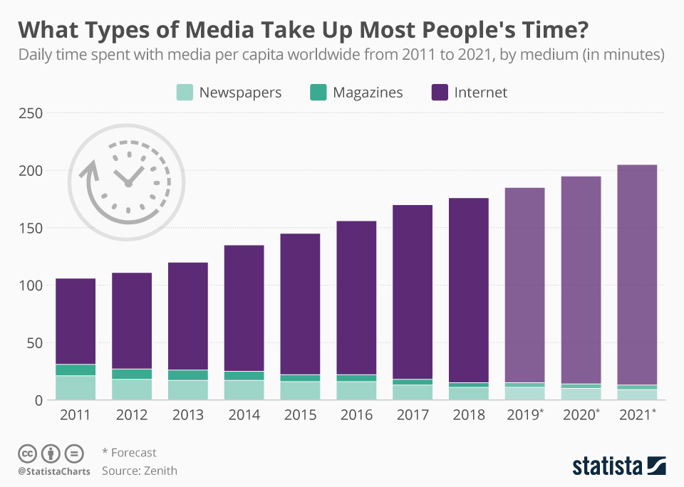
We now live in a world where people are engaged with technology and mobile devices so much more than they used to be. In fact, CNN recently reported that Americans dedicate 10 hours and 39 minutes per day on their multimedia devices. All of these screens display vivid and colorful app icons and images. So, when we see something that isn’t very colorful, we can argue that it is abnormal to the modern viewer—would you rather watch TV in color or black and white?

Study: What Types of Media Take Up Most People’s Time? [Aug 16, 2019].
Consumers have limited attention spans and have pushed print aside as they shift onto more digitized mediums. It is forecasted that the average individual will spend nearly 3 hours on their devices each day, and this number will increase each year. Specifically, on mobile devices where the smaller screens and fast scrolling demand information to be digested quickly and efficiently.
The test: which colors communicate data most effectively?
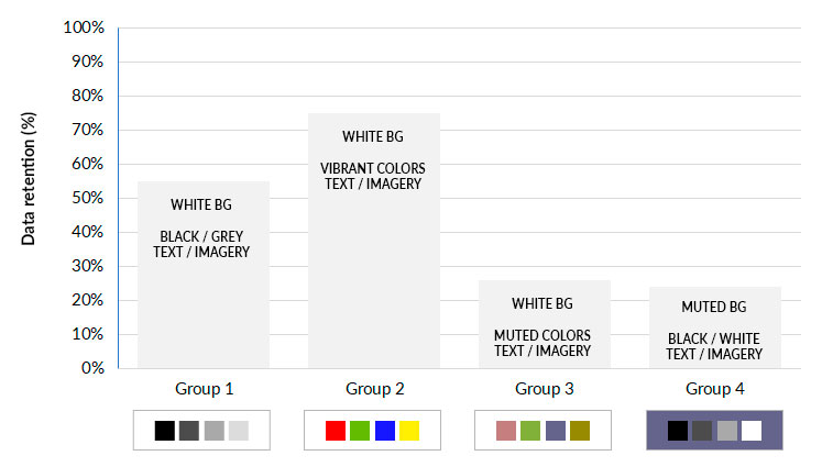
We’ve done some color analysis ourselves here at SociallyInfused. We created four versions of a fabricated report and had a test group of 80 business professionals (from various fields) review the data. All four versions were identical in every way except for the color of the data points.

Survey: SociallyInfused Media [September 22, 2019].
- Control group #1 reviewed the report on a white background with black and grey text, graphs, and tables.
- Group #2 reviewed the report on a white background with vivid colors to highlight the data points.
- Group #3 was given the report on a white background with various muted colors (low intensity of illumination) to highlight relevant text and graphic images.
- Group #4 was delivered the same report on a background of various muted colors with black and white text to underscore notable data points.
We then quizzed each reader about the detailed findings of the report to understand just how much of the data was absorbed by them.
Some very colorful feedback
The results were evident:
- Groups #1 and #2 retained the important data at a much higher rate.
- Groups #3 and #4 absorbed the data at a similar rate to one another, but at a much lower rate than the first two groups.
Based on our test results, we believe that high contrast design had a significant role in the consumption and retention of our data points as both groups #1 (black on white) and #2 (vivid colors on white) display themselves in easy-to-read, high contrast.
After this, we ran similar tests to identify the ‘right’ high-contrast and vivid colors for reporting data. We concluded that blue, green, yellow, and red are the most effective colors when expressing visual sentiment. You see, in a time where we all suffer from information overload, our data points must be vivid and colorful too. We aren’t using color to influence a reader’s perception intentionally. Instead, we know color already affects the modern reader’s in their day-to-day experiences (for instance, red is ‘incorrect’ or ‘wrong’) and utilize those controls to create associations that make it easier to digest the valuable information quickly and retain it.
Dissecting our winning colors
RED: Most games already exploit the color red to denote wrong, disappointment, or incorrect. On a report, a red datapoint conveys a negative or weak performing datapoint. On the other hand, red doesn’t always have to denote a flop—it can also be associated with action or determination.
GREEN: Green is often connected to positive growth or upward trends. Within a report, incorporating a green data point provides a trigger to evoke a positive experience.
BLUE: Why do many social media brands like Twitter, MySpace, LinkedIn, Facebook, and Instagram all utilize several shades of blue for their branding? Well, the color blue promotes interaction, but it is also related to the highest rating or performance—it surpasses the production of green and is associated with over-achieving.
YELLOW: Finally, yellow means “okay” or “average.” It’s not abysmal, and it’s not notable—it’s a passing mark and means “to tread with caution.” Yellow is polarized, meaning that you have an equal opportunity of improving to green (positive) or dropping to red (negative).
Vivid colors + high contrast = peak data retention
I’m sure, by now, we’re all in agreement that the colors we choose to use in our reports are essential if we want the readers to digest the information that we are presenting.
Vivid colors that are crisp and, again, high contrast, without being too similar to one another, are important for the presentation of your data points. Then, apply that color palette throughout your report; this ensures a smooth and unified read for your audience, and better marketing activities within your strategy.


